“MOON” 150x130 from
2023-2024
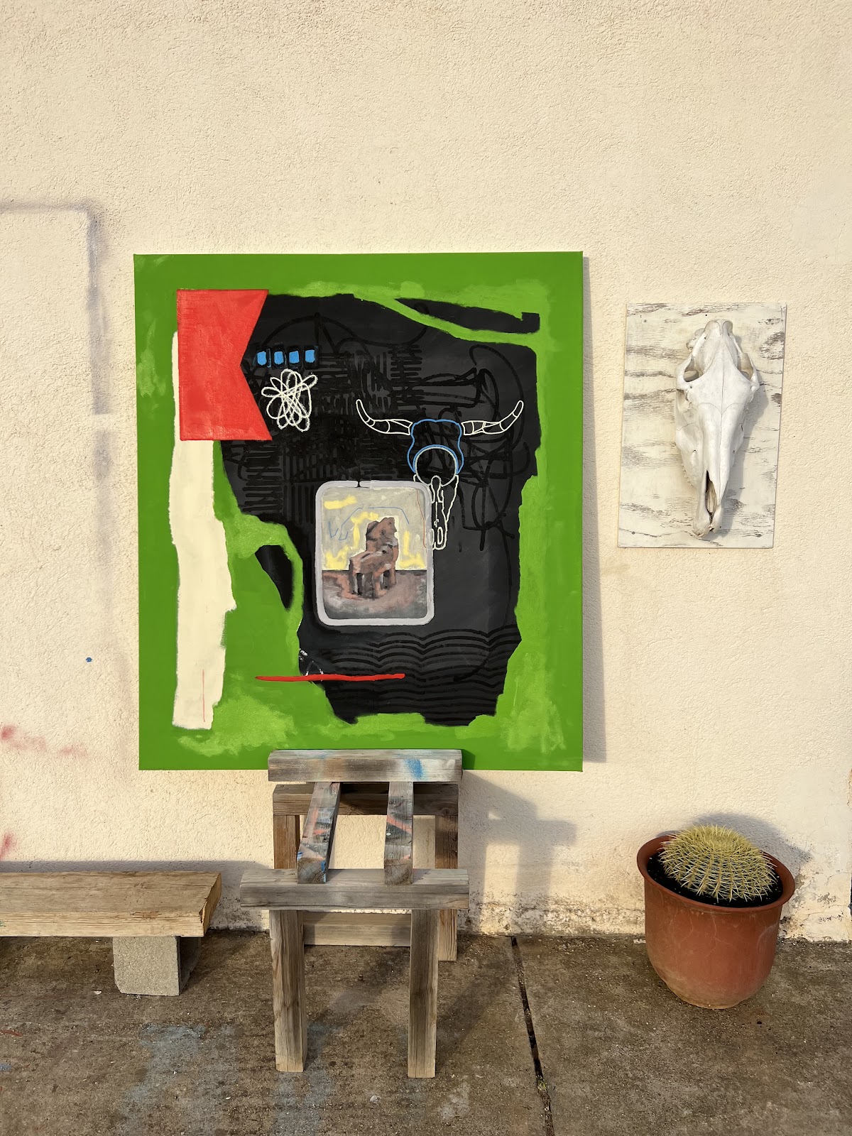
Status: framed, finished, in europe
I love this piece as I believe it symbolizes a change in direction that I’m taking at the moment—opting for simplicity, restraint, and honing my skills of painting with regards to brush control and layering. Texture is very important to me so the blacks are combined in a specific way and I love to incorporate the western theme hence the steer skull—a prominent symbol from my birth home in Colorado. You’ll see that the line work is much more refined from when I first started painting. To me this is progress ! I’m sure some people prefer the brutality of my earlier works but alas…one must evolve ! This piece was finished in 2024.
“Baby Take Off Your Cool”
This piece and the next are very related although the first one was made in the US and next one was made in Europe. An exploration into color, texture, attempting to create something that looks “worn”. This currently hangs in the home of my beloved second family--the Sweeneys. They played a great part in my transition into “Artist” and I couldn’t think of a better piece to have hanging in their cute home. Miles Davis features prominently in the center with the Eye of Horus watching over. Here I am starting to experiement with these flow lines, greatly inspired by the painter and photgrapher Jose Parlà. The Ouraborous was a central theme at the time as I was just retiring at this point and felt many things coming full circle. The name comes from the Outkast song by the same name featuring Norah Jones which I discovered in this period and couldn’t stop playing in the studio.

“CUARANTENA”
2020-2022

This piece is currently hanging in our living room. With this piece I was beginning to explore texture and energy using a variety of spray paints, markers, acrylic paint and house paint to create this almost transparent quality to the ombre shades. Around this time I also started using the iPad to superimpose images onto canvases as a way of testing different shapes and figures to create an abstract narrative. Along with the graffiti writing and flow with the sprays and markers I was beginning to experiment with different geometries and breaking the works into different boxes as can be seen with the faint red straight lines. One of my earliest “tags” is also visible in this piece underneath the face of the African musician who seems to be fading into the background. This canvas was actually cut into its shape from an enormous piece of canvas that I had laid on the floor of our previous warehouse that we inhabited before and during the Covid pandemic. Once we were allowed back outside again I began layering the faces and body. I’ve always been curious of injecting some sensuality into my paintings as they are typically very crude, so this outline of the naked woman that I had saved from a tattoo design by Swift Death Club felt appropriate to try to recreate here. At first she was chained, but what I love about painting is the impulse you can have on the narrative, so by covering her up in this rusty red, I was able to free her in a sense. I also love the contrast of the faceless body with the bodyless face. At the time I was reading Haruki Murakami’s Killing Commandante which prominently features a faceless character so this concept came through from that abstraction. As with all my pieces, I appreciate a variety of interpretations as they can create different stories for different people.
“SOUL”
2020-2021

One of our earliest texture pieces--this was created by myself and my friend David Rosellò. Underneath you can barely make out the word SOUL which I’ve gone on to spread through various canvases and walls in Spain and the US. I felt that graffiti writing was too ego centric as if everyone was screaming their name from the walls...that it was only about territory and not about injecting some impulse into their urban landscape. I decided that I would quite literally leave my soul everywhere, using the word almost as a reminder to people of the simple concept of “soul”. The top portion is an early exploration into the texture series that follows entitled Mantra.
“Mantra.B1, Mantra.B2”
2021

and

Both of these pieces have happy homes. Entitled Mantra due to the repetitive nature in the creation of them, this is a foray into texture and color and vibrancy.
“Terrors/Desires” 2m x 3m

Another piece from this time period currently hanging in our home is this one. Around when I became interested in these repetetive textures with spray paint, I also became mildly obsessed with building perspective grids, especially on a large scale.
“DJ BOOTH” metal, stick welded
2021
Out of necessity I built almost everything in our art studio, and this metal structure was my first foray into welding. Equipped with a friends stick welder and saw, I watched a few youtube videos, tried a few welds and put this beast together. Very happy with how it turned out and still using it today !


Bartali Mural Project
concept/math drawing:

before:

during:


finished:

/
“OLDER WORKS”
“Tailwind Anatomy” approx 2m wide x 1.5m tall framed in Boulder

“ROSES” approx. 175x203 (can be framed to be shorter)
Summer/Fall 2017
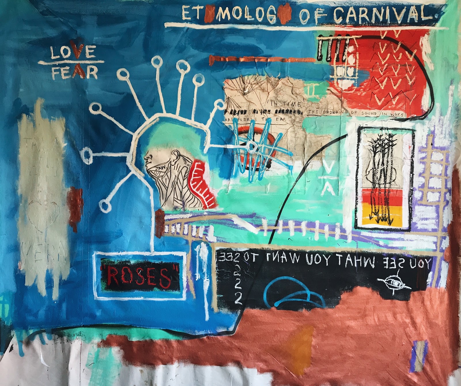
Status: unframed, finished, in Boulder
Story: This piece was started in August of 2017 just after the Colorado Classic of that year and one month after I finished my first Tour de France. The piece started with the drawing of the jaw and evolved over months into what you see here. I believe I finished the piece in the off-season in October. This is one of my favorite pieces for how colorful and vibrant it is. This piece also came at a time when I was very seriously considering stepping away from the sport as the team I was racing for had announced that it didn’t have a title sponsor for the following year and instead of chasing a contract I was content to let things pan out, secretly hoping that I could just follow my dream of becoming an artist. I had finished the tour, checked that box and I would say that this was the beginning of the end (I wouldn’t retire until 2 years later in 2019).
During this time period I was starting to make more music and becoming more interested in the mathematics involved hence the phrase on the map “the ordering of sound in ways that please the ear”. The arrows on the right could be perceived as my quiver and represents a desire to add as many creative skills to my arsenal as possible.
The way I initially interpreted this painting was more to do with my relationship with my partner Kasia, with “ROSES” representing other possible connections and “etymology of carnival” literally meaning giving up meat. However, upon further reflection and considering the time period, it is becoming more clear that I am being pulled from a life that I had known for my whole adult life (cycling, professional sport) and I am falling for a multitude of creative processes (roses) as well as considering “giving up meat” which I would now interpret as letting go of ego and no longer striving to be better than others. As you can see, the JAW in the drawing is closed tight so all of this dialogue is being pent up inside as I am still going from race to race, and Love Over Fear is a reminder for how I must continue forward if I am to ever make this change that I am fantasizing about.
Finally, as with all of my paintings, they may mean something different to anyone who views them so “YOU SEE WHAT YOU WANT TO SEE” is written backwards, a nod to the sentence itself and a way to hide the sentence in plain sight.
The price for this piece is higher than something I would make as a commission like “MOON” because I only have a select few of these pieces from this time period and they all have a rawness and almost an innocence about them because I was making them purely for myself, so if they are to be sold it is important that they are priced respectively.
At this link you can see the evolution of this painting: https://share.icloud.com/photos/0155Eq3hwaz6KdXDszBNT8akg
“UNTITLED Fire On A Leash” approx 150x203 (need to confirm measurements)
Spring 2016
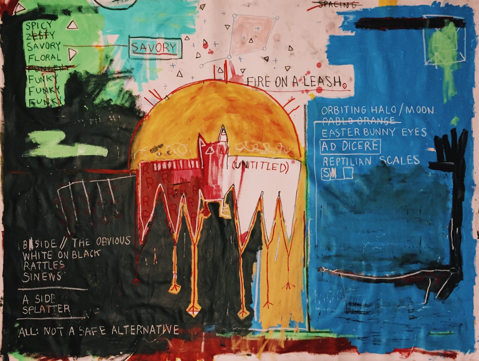
Status: framed, finished, in Boulder
Story: I had a 16 month break from the professional world of cycling between 2014 and 2015 and it was in this time that I began painting and exploring creative expression. I made my return to racing in the late summer of 2015 with wins coming straight away in Colorado and at the world championships in Richmond (TTT with BMC). As soon as I was back in the cycling environment I could feel that I was a different person, seeing through different eyes, while the sporting environment remained largely unchanged. 2016 was an Olympic year and one of the most difficult off seasons and early seasons for me to wrap my head around being a disciplined athlete again. I had an explosion of creativity in the spring of this year when I was coming back and forth from early season races. This piece was made on the floor of an Airbnb in girona (where I live now) along with a few others and many chaotic drawings. A lot of my pieces from this time period illustrate a duality within myself, a rift between a more binary athletic side and a more fluid, colorful and explosive artistic side. I’ve always resonated with bats from a young age perhaps because I feel most creative at night when the world sleeps, and you can see this duality in the bat. Furthermore, after the injuries I sustained in 2014, I have been hyper aware of imbalances or differences between my right and left side, heightening this sense of duality in my physical body. At the time of this painting, my days as a free artist felt like a distant memory and I felt chained to my routine and the bland repetitive nature of the cycling environment. This is demonstrated with the phrase “FIRE ON A LEASH” amidst distant stars that are almost fading into the background. The words to describe various tastes are covered up or scratched out, with one word “SAVORY” standing out almost like a cry for help. I was searching for my savior. I often equate my right side to be my athletic side with my left being my creative side and you can see that the left is almost blank with the word “UNTITLED” as if to represent something started but unfinished. Diving even deeper there is a left arm which appears to be almost drowning in a sea of blue, waving its hand as the body is being carried under. This piece is raw and intense and evocative, clearly a snapshot of my inner torment during this time of indecision.
“CHIEF” approx 120x304 (need to confirm measurements but this one is tallllll)
Fall/Winter 2016
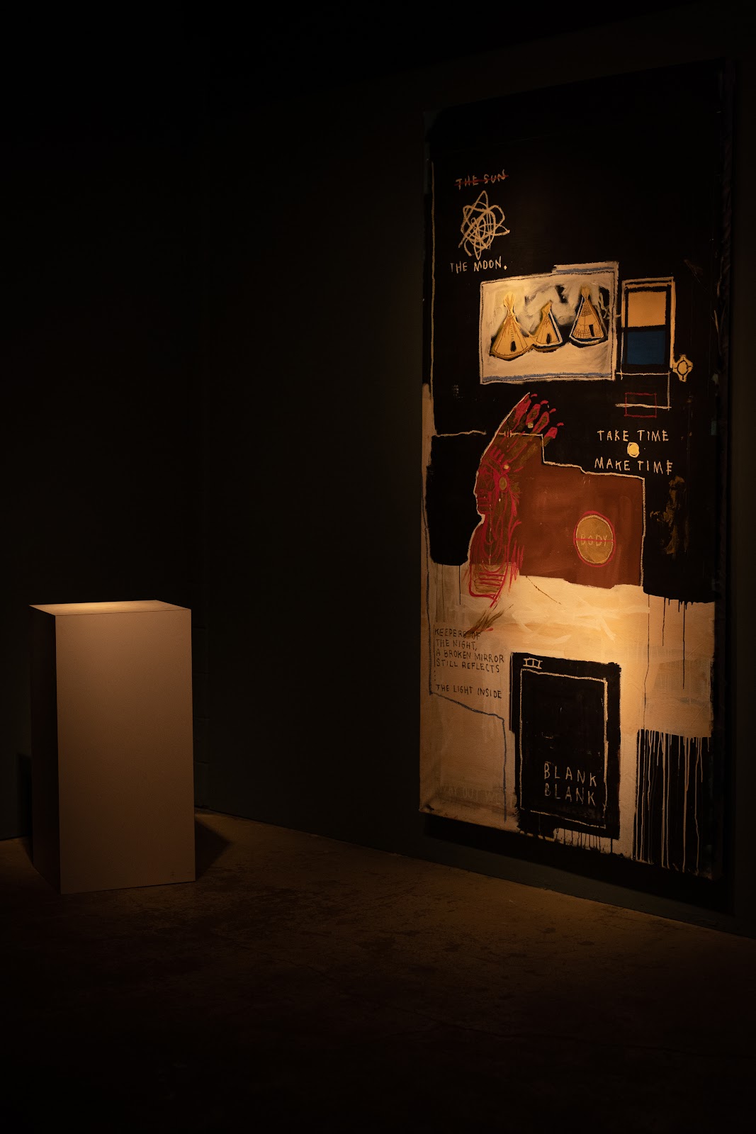
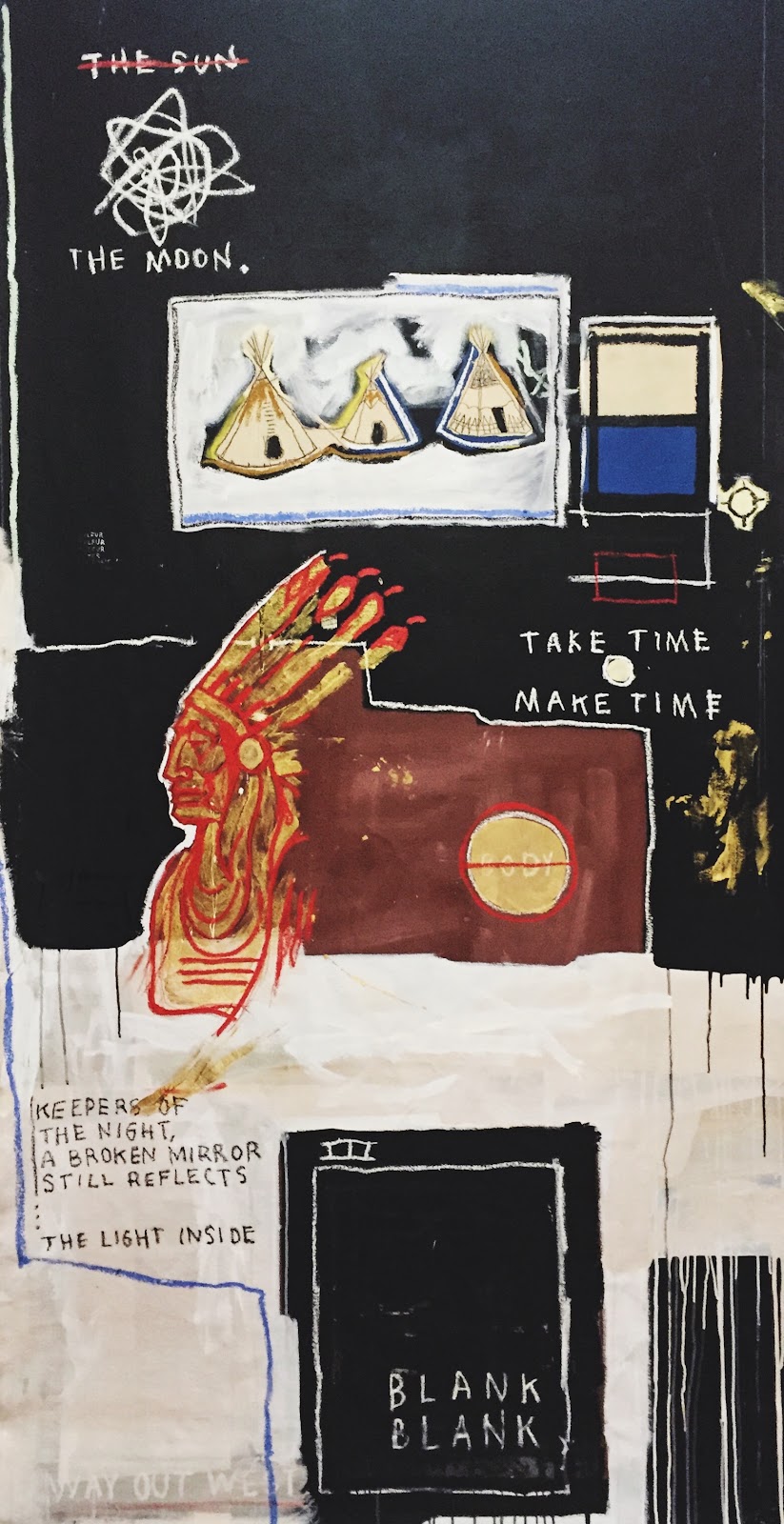
Status: framed, finished, in Boulder
Story: This piece was originally commissioned by a hotel in park city that never actually got built. I was unable to follow their initial instructions anyway as once I started I couldn’t help but let the piece take on a life of its own. I started on this piece after a whirlwind journey in summer of 2016 from the Rio Olympics to Belgium, to Qatar, then to Japan and finally back home to Colorado. I made this piece in my house in Boulder when I was settling back into things and continued working on it through the winter. At this point I was starting to become more interested in western themes, specifically Native American culture and philosophy. I have always resonated deeply with Native American tradition being from Colorado although I have no Native ties in my DNA. I wanted to create a piece to honor them and what I was learning in that time period. The teepee is a symbol that I’ve always used for “home” and was the first thing I started painting on walls here in Spain as graffiti. There are many layers to this piece, some hidden words like “WAY OUT WEST” which to me represents more of a state of mind. “Take Time Make Time” is a theme that was popping up in my mind quite a lot during this period, this idea that if you do something properly i.e. if you take the time to see it through, that you in fact make time on the back end. There is another meaning to this which is more possessive in which you can imagine physically taking time in order to make time. I’m not going to pretend as a white male of English descent that our story with the native people of this land is a good one, and I hope with this painting to show my appreciation for their wisdom and to honor the fact that the land which we now call home was at first their home for many more generations than us. “Keepers Of The Night, A Broken Mirror Still Reflects The Light Inside” is a coupling of a few phrases that were in my orbit during the creation of this piece. As I interpret it, the keepers of the night represent the native people, a broken mirror represents the people who look like me—those who are descendants from those who forced the natives out, and the light inside being the genuine respect and admiration that I feel for a culture that is not my own but that has impacted me greatly.
-Taylor
Taylor.phinney@mac.com